
InDesign Portfolio
The different designs below are Indesign based designs that were created to polish our Adobe InDesign skills.
Sawdust Festival
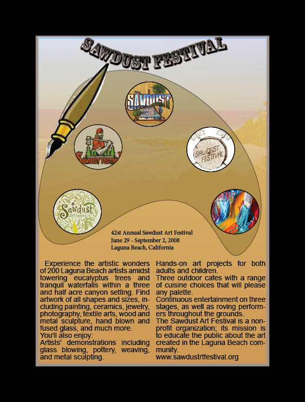
I choose this to be my final design because when visiting the website and reading up on their information I realized that the Sawdust Festival was similar to an art exhibit of numerous type sof art. I choose to go with a painting pad because of the art theme around the Sawdust Festival. I knew by using the painting pad I would be able to integrate many of the techniques that we practiced in class such as fitting images to circular frames, and also using the convert direction point too to create my own shapes such as the painting pad.
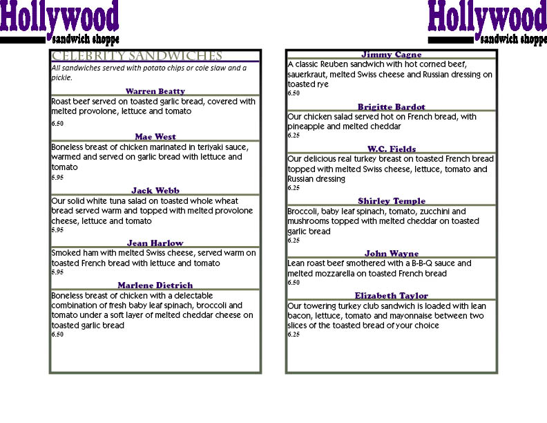
Hollywood Sandwich Shoppe
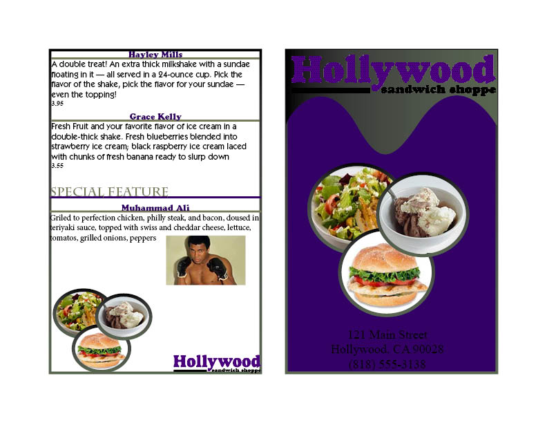
I choose for this design to be my final design because it has all the following information and designs that the client wanted. In my design I used several design techniques, such as fitting and placing pictures into circles and numerous paragraph styles to get the text perfect. I also used gradient colors for the border to give it a more interesting look. The final color scheme that I used was black, purple, and grey because it was the colors for the logo. I didn’t want to incorporate too many colors because I felt that would make the design gaudy and no customers would want to read. Basically I used a three color scheme that would make the design appealing to the eye. I believe this design is not overly colorful but it’s something the customers would want to look at without saying it’s too much. The main reasoning behind this design is because it includes everything that the client wanted and would be an attractive.
Humane Society Calendar
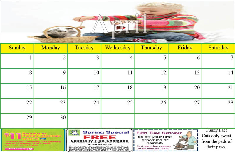
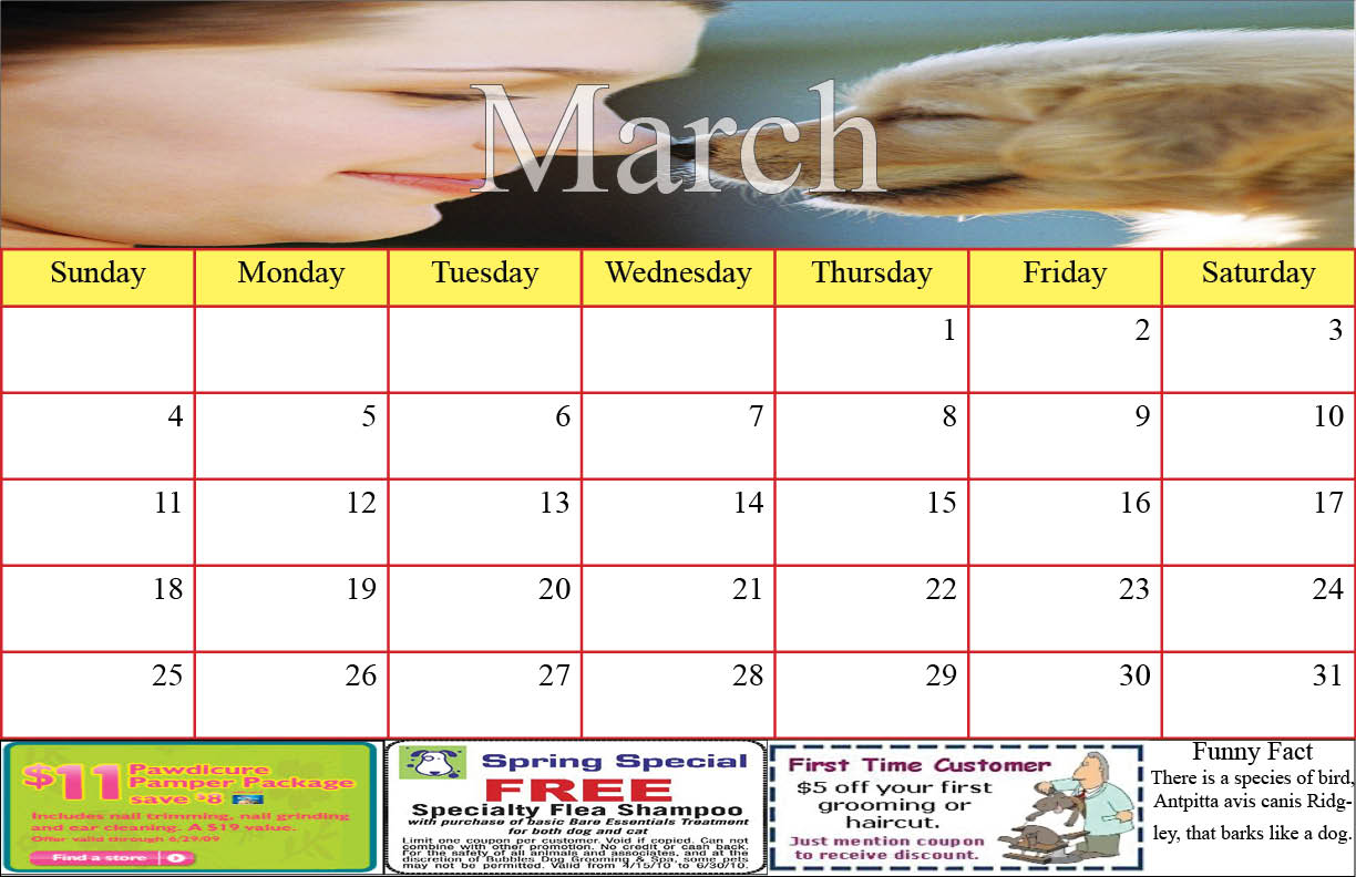
There were several reasons that I decided on this design as my final design. First off I thought that the three months that I made for this calendar are very appealing to the eye and fulfill all the requirements necessary for the project. For all three months I tried to keep a basic color scheme only changing the lines in the cells to different colors. My thought behind this was to have some variety in color between the months but not have it extremely colorful where it was gaudy. Secondly, I choose this to be my final representation of the design because I felt it was a creative layout. This project caused me to exercise several of the recent InDesign techniques that we learned in class the previous week. Overall I though this scheme was correct in portraying the necessary requirements needed for the Human Society Calendar.